Best DSAT Lessons - "Command of Evidence (Quantitative)"

Introduction & Overview

Relevance in the Digital SAT

  • Falls under the "Information and Ideas" content domain in the Digital SAT.

  • Appear as the 5th skill category in the Reading and Writing section, following Central Ideas and Details and alongside Command of Evidence (Textual).

  • In a single module, you'll encounter 1-3 questions focused on "Command of Evidence (Quantitative)".

  • Approximately 5 questions across the full test (~7% of the Reading and Writing section).

What This Skill Assesses

This skill evaluates your ability to:

  • Extract Key Data: Identify trends, patterns, or specific values from graphs/tables.
  • Relate data evidence to Text: Determine how quantitative evidence supports, contradicts, or clarifies claims in the passage.
  • Draw Inferences: Make logical conclusions based on combined textual and numerical information.
  • Evaluate Accuracy: Assess whether data aligns with hypotheses or author's arguments.

What are "Command of Evidence (Quantitative)" Questions?

Key Insight

"Command of Evidence (Quantitative)" questions uniquely combine reading comprehension (text analysis) with data literacy (quantitative reasoning). They mirror tasks in STEM, social sciences, and research, where arguments are built on quantitative evidence.


Core Definition

Questions in this category require you to:

  1. Analyze quantitative data (tables, graphs, charts) paired with a short text.
  2. Connect the data to a statement, hypothesis, or claim—either by completing, supporting, challenging, or weakening it.

Key Characteristics

1.Basic Question Structure

  • A short passage with a claim/hypothesis + visual data (table, bar graph, line graph, or scatterplot).
  1. Two Main Question Prompts:
    Always phrased to focus on how data interacts with text:

    • "Which choice most effectively uses data from the table/graph to complete the statement/text?"
    • "Which choice best describes data from the table/graph that supports/weakens the author's argument?"
  2. Visual Data Types:

    • Tables: Display exact values (e.g., experimental results).
    • Bar/Line Graphs: Show trends or comparisons.
    • Scatterplots: Highlight correlations between variables.

Sample Question(Illustrative, Not Strategic)

Passage:
"...A city planner claims that increased bike lane availability reduces traffic congestion...."

Table Data:

YearBike Lanes (miles)Avg. Traffic Delay (minutes)
20191025
20201520
20212512

Question:
"Which choice best describes data from the table that supports the planner's claim?"

Options:
A). ...
B). ...
C). ...
D). ...

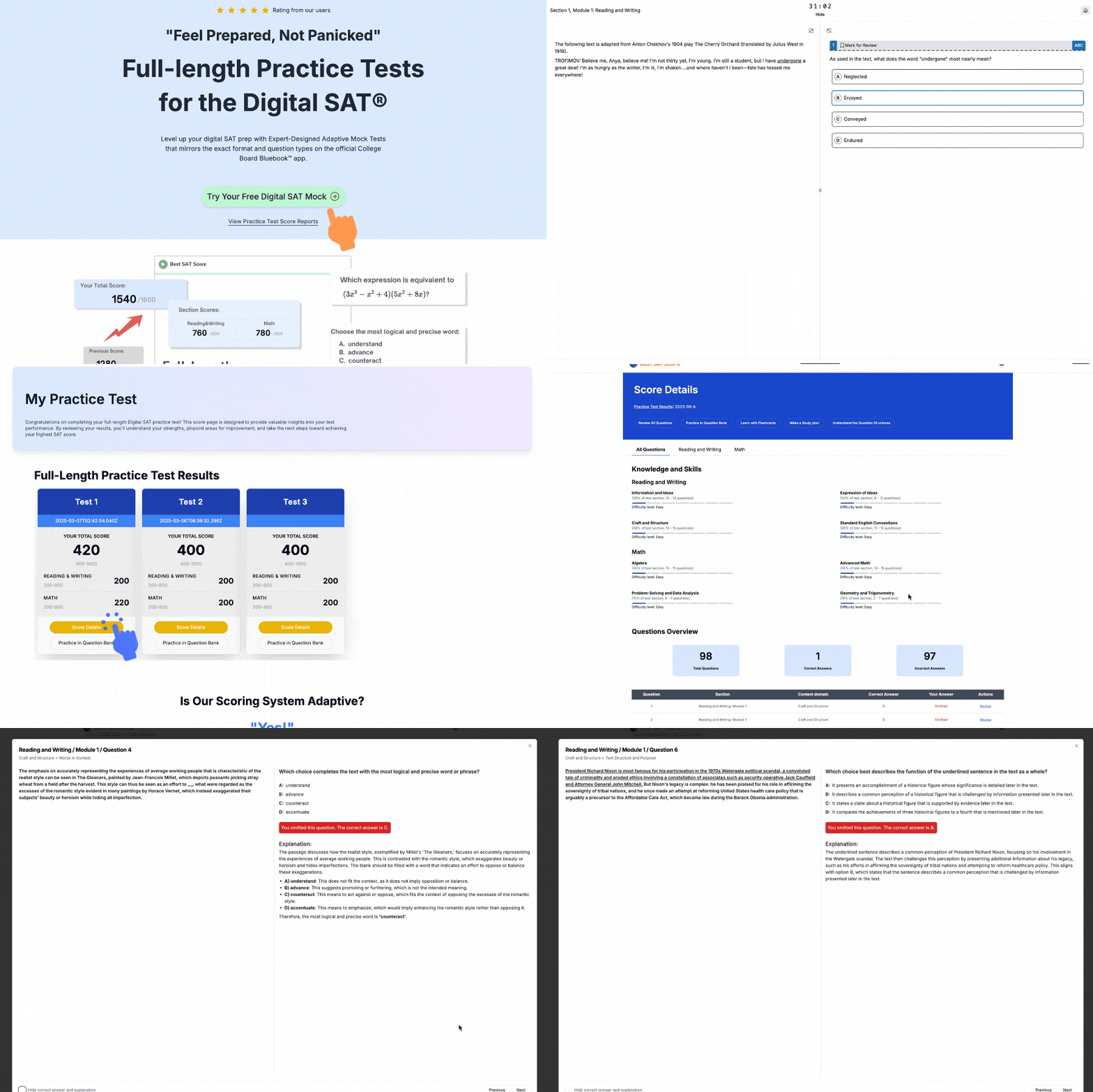
Free Full Length SAT Tests withOfficial-StyleQuestions

Practice with our full length adapive full testreal test-likequestions and proven300+points score boost

Digital SAT questions preview

How to Think About "Command of Evidence (Quantitative)" Questions?

1. Understand the Argument

Key Idea: The prompt's text defines what matters. Ignore extra details in the data unless they support the argument.

How to Do It:

  • Read the introductory paragraph carefully. Identify:
    • The claim (e.g., "Solar energy use has increased rapidly").
    • The scope (e.g., "from 2010-2020 in the U.S.").
  • Ask: What data would prove this claim? (e.g., a rising trendline in a graph).

The correct answer must directly support this claim. Irrelevant true facts are wrong answers!


2. Read the Data Strategically

Key Idea: Graphs/tables include more data than you need. Focus only on what aligns with the argument.

How to Do It:

  • Identify the relevant variables (e.g., if the claim is about "cost," find cost-related data).
  • Note labels/units (e.g., years, percentages) to avoid misreading.
  • Ignore distractions: Cross out unrelated data points mentally.

Highlight keywords in the prompt (e.g., "increase," "highest," "compared to") to guide your search.


3. Evaluate Answer Choices

Two types of incorrect answers appear:

TypeHow to SpotAction
False StatementsContradict the data (e.g., "decreased" when the graph shows an increase).Eliminate immediately.
True but IrrelevantAccurate data not supporting the argument (e.g., correct numbers about wind energy when the claim is about solar).Eliminate: they don't answer the question.

Golden Rule:
The right answer must:
✅ Be factually correct.
✅ Directly support the argument.


Example Workflow

Prompt: "Studies show electric car sales grew fastest in California after 2015."

  1. Argument: "Fastest growth in California post-2015."
  2. Data Check:
    • Find a line graph with "California vs. Other States, 2010-2020."
    • Focus on the slope of California's line after 2015.
  3. Eliminate Wrong Answers:
    • "Sales peaked in 2010" → False (eliminate).
    • "Nevada sales doubled by 2020" → True but irrelevant (eliminate).
    • "California's sales rose 200% from 2015-2020" → Correct and on-topic.

➨ 1. Practice Active Reading: Summarize the argument in your own words.
➨ 2. Annotate Graphs: Circle/highlight key data points.
➨ 3. Time Management: Spend <60 seconds per question. If stuck, flag and move on.

Step-by-Step Solutions to "Command of Evidence (Quantitative)" Questions

Follow this systematic approach to tackle quantitative evidence questions efficiently.


🟠 Step 1: Skim the Graph/Table (5-10 seconds)

Goal: Familiarize yourself with the data's topic, structure and variables-not deep analysis.

What to Look For:

  • Title/Labels: Identifies the topic (e.g., "Annual Carbon Emissions by Country").
  • Axes/Columns: Units (e.g., "tons CO2") and categories (e.g., years, countries).
  • Trends/Patterns: Quick note of highs, lows, or correlations.

Example Table:

YearElectric Cars Sold (Thousands)
20201,200
20211,800
20222,600

Key Takeaway: Electric car sales increased yearly.


🟠 Step 2: Read the Passage (20-30 seconds)

Focus: Identify the main claim/argument and what data to retrieve.

Case 1: Passage with a Blank

Blank Location: Always at the end, requiring data to complete the text.

Example Passage (Environmental Study):
"A 2022 study examined whether subsidies for electric vehicles (EVs) boosted adoption rates. Researchers compared EV sales in countries with and without subsidies, controlling for median income......The data revealed that ______."

Question Prompt:
"Which choice most effectively uses data from the table to complete the statement?"

Key Clue: The blank needs data information showing how subsidies affected EV sales.


Case 2: Passage Without a Blank

Focus: Link data to support/weaken the argument.

Example Passage (Social Science):
"Some economists argue that raising the minimum wage reduces teen employment......They cite a 10-year study tracking employment rates in states with varying wage policies......."

Question Prompt:
"Which choice best describes data from the graph that weakens this claim?"

Key Clue: Look for data where higher wages didn't reduce teen employment.


🟠 Step 3: Validate the Choices

Goal: Eliminate choices with false data or irrelevant information.

Example Choices (Based on EV Sales Table):

  1. "EV sales peaked in 2020 at 1.2 million units."
    • False: The table shows 1,200 thousand (1.2M), but sales increased after 2020. → Eliminate.
  2. "EV sales grew by 1,400 thousand units from 2020 to 2022."
    • True: 2,600 – 1,200 = 1,400. → Keep.

Rule: Only proceed with factually accurate choices.


🟠 Step 4: Find the Best Evidence (Critical Step!)

Trap: Correct data ≠ Relevant evidence.

How to Test Remaining Choices:

  1. Revisit the Claim/Argument:
    • EV Study Example: The passage asks for data showing subsidies' impact.
  2. Ask:
    • "Does the data directly illustrate/support the conclusion?"
    • "Is it the most precise match?"

Final Filter:

  • Weak Choice: "EV sales increased over time."
    • True but too vague-doesn't link to subsidies.
  • Strong Choice: "EV sales rose by 1,400 thousand units after subsidies were introduced."
    • Directly connects subsidies to growth.

⚡️ Tip: In real SAT, highlight keywords in the passage (e.g., "supports," "weakens") to stay focused.
Worksheet: "Argument"-"Data" Practice

Example 1

Annual Electric Car Sales by Region (2018-2023)
(Unit: Thousands of Vehicles Sold)

YearNorth AmericaEuropeAsia
2018120180250
2019150210300
2020200240320
2021280310400
2022400380480
2023550450520

A recent study by the International Energy Agency analyzed global electric car adoption. Researchers found that North America experienced the most rapid growth in electric vehicle (EV) sales between 2020 and 2023, surpassing Europe and Asia in annual increases. This surge is attributed to aggressive government subsidies and expanded charging infrastructure. While Asia remained the largest market in total sales, its year-over-year growth rate slowed after 2021. Europe maintained steady growth but was outpaced by North America's 175% sales increase from 2020-2023.


Tasks:

  1. Identify the argument of the text. (What claim does the data need to support?)

  2. For each evidence, mark [F] for "False Statements"; [T-I] for "True but Irrelevant Statements"; [T-R] for "True and Relevant Statements":

  • a. North America's EV sales rose from 200,000 in 2020 to 550,000 in 2023.
  • b. Asia sold more EVs than Europe in every year shown.
  • c. Europe's sales grew by 90% from 2018-2023.
  • d. North America's sales exceeded Europe's in 2023.
  • e. Asia's sales peaked at 520,000 in 2023.
  • f. Government subsidies had no impact on EV sales.

Example 2

Bacterial Colony Counts (CFU/g) in Contaminated Yogurt at Various Temperatures
(Colony-forming units per gram over 72 hours)

Hour4°C (Refrigeration)20°C (Room Temp)35°C (Warm)
0505050
242001,20010,000
4850050,0001,200,000
721,000800,0009,500,000

A microbiology study examined how temperature accelerates proliferation of psychrotrophic and mesophilic bacteria in yogurt. Under ambient conditions (20°C), bacterial counts reached alarming levels within 48 hours, demonstrating exponential growth. However, refrigeration (4°C) significantly inhibited bacterial multiplication, yielding only 1,000 CFU/g by 72 hours—a stark contrast to the prodigious 9.5 million CFU/g observed at 35°C. Researchers concluded that perishable foods stored above 4°C risk rapid microbial colonization, which correlates with organoleptic spoilage (e.g., odor, texture degradation). Notably, mesophilic strains dominated at higher temperatures, while psychrotrophic bacteria persisted even under refrigeration.


Tasks:

  1. Identify the argument of the text. (What claim does the data need to support?)

  2. For each evidence, mark [F] for "False Statements"; [T-I] for "True but Irrelevant Statements"; [T-R] for "True and Relevant Statements":

    • a. Refrigeration (4°C) reduced bacterial growth to 1,000 CFU/g after 72 hours.
    • b. At 20°C, bacteria grew exponentially but never surpassed 100,000 CFU/g.
    • c. Psychrotrophic bacteria thrive exclusively in subzero temperatures.
    • d. Mesophilic strains multiplied most aggressively at 35°C.
    • e. Yogurt's pH level dropped by 1.5 points during the experiment.
    • f. Ambient storage (20°C) allowed 800,000 CFU/g by 72 hours, indicating high spoilage risk.

Example 3

A 2023 pan-European survey examined generational differences in consumption habits. Younger consumers (18–30) showed the strongest preference for sustainable products and online shopping, while older demographics (51+) prioritized cost efficiency and in-store experiences. Notably, middle-aged respondents (31–50) were the most likely to research products before purchasing, suggesting a pragmatic approach. The study concludes that while sustainability appeals to younger buyers, affordability remains the dominant factor across all age groups. These trends highlight a generational divide in consumption values, with implications for retailers adapting to shifting market demands.


Tasks:

  1. Identify the argument of the text. (What claim does the data need to support?)

  2. For each evidence, mark [F] for "False Statements"; [T-I] for "True but Irrelevant Statements"; [T-R] for "True and Relevant Statements":

  • a. 88% of consumers aged 51+ prioritize price over brand names.
  • b. Middle-aged respondents (31–50) are the least likely to research products.
  • c. Online shopping is equally popular among all age groups.
  • d. Sustainability is the top priority for consumers over 50.
  • e. Younger consumers (18–30) prefer online shopping more than older groups.
  • f. The survey included responses from 5,000 European participants.

Example 4

A decade-long study published in Gerontology Today examined the relationship between sleep duration and age-related functional decline. Researchers found that participants who consistently slept 7–8 hours per night exhibited the slowest cognitive and physical deterioration, with significantly lower decline scores in memory, processing speed, and mobility compared to short (≤5 hours) or long (≥9 hours) sleepers. Notably, sleeping fewer than 6 hours was linked to accelerated memory loss—equivalent to 4.5 extra years of aging—while excessive sleep (≥9 hours) correlated with reduced motor function. The study suggests that optimal sleep duration may mitigate age-related decline, though further research is needed to determine causality. Lifestyle factors (e.g., diet, exercise) were controlled for in the analysis.


Tasks:

  1. Identify the argument of the text. (What is the study's main conclusion about sleep and aging?)

  2. For each evidence, mark [F] for "False Statements"; [T-I] for "True but Irrelevant Statements"; [T-R] for "True and Relevant Statements":

  • a. Participants who slept 7–8 hours had the lowest decline scores in all categories.
  • b. Sleeping ≤5 hours worsened memory more than sleeping ≥9 hours.
  • c. The study did not account for participants’ caffeine intake.
  • d. Physical mobility decline was worst in the ≤5-hour group.
  • e. Long sleepers (≥9 hours) showed faster processing speed than short sleepers.
  • f. The research controlled for exercise and diet but not stress levels.

Example 5

Top U.S. Tariff Impacts by Country (2021)
(Changes in bilateral trade volume & tariff rates vs. 2020)

CountryAvg. Tariff Rate IncreaseExport Decline to U.S.U.S. Export Growth
China+7.5%-12%+2%
EU+3.2%-5%-1%
Mexico+1.8%-3%+4%
Canada+2.1%-4%-2%

A 2022 Congressional Research Service report analyzed Section 301 tariffs maintained through 2021. These protectionist measures aimed to reduce trade deficits but yielded asymmetric results: While Chinese imports dropped sharply, the U.S. only saw modest export gains. Smaller tariff hikes on EU and Canada correlated with milder disruptions, but triggered retaliatory duties that reduced American exports (-1% to EU, -2% to Canada). Mexico proved an exception—despite tariffs, U.S. exports grew, likely due to USMCA provisions. The data suggest tariff efficacy depends on preexisting trade agreements and partners' capacity to absorb costs.


Tasks:

  1. Identify the argument of the text. (What claim does the data need to support?)

  2. For each evidence, mark [F] for "False Statements"; [T-I] for "True but Irrelevant Statements"; [T-R] for "True and Relevant Statements":

    • a. China's 7.5% tariff hike caused the largest import reduction (-12%)
    • b. U.S. exports to all tariffed countries declined in 2021
    • c. Mexico was the only partner where U.S. exports increased (+4%)
    • d. Canada's -4% export drop matched its 2.1% tariff increase
    • e. The EU retaliated with digital services taxes in 2021
    • f. Section 301 tariffs primarily targeted agricultural products

Example Answer Keys

Example 1

  1. Argument: North America had the fastest growth in EV sales from 2020-2023, driven by subsidies and infrastructure.
  2. Evidence Analysis:
    • a. [T-R]: Directly supports the argument (shows North America's growth).
    • b. [T-I]: True but irrelevant (the argument focuses on growth rates, not total sales).
    • c. [T-I]: True but off-topic (covers 2018-2023, not the key period 2020-2023).
    • d. [T-R]: Relevant (supports that North America "surpassed Europe").
    • e. [F]: False (Asia's sales peaked at 520,000 in 2023, but the text states they slowed after 2021).
    • f. [F]: False (the text credits subsidies for North America's growth).

Example 2

  1. Argument: Temperature dramatically affects bacterial growth in yogurt, with refrigeration inhibiting proliferation and warmer temperatures causing rapid spoilage.
  2. Evidence Analysis:
    • a. [T-R]: Directly supports inhibition of growth at 4°C.
    • b. [F]: False (20°C reached 800,000 CFU/g by 72h; "never surpassed 100,000" is incorrect).
    • c. [F]: False (psychrotrophic bacteria persist in refrigeration, not just subzero).
    • d. [T-R]: Relevant (supports dominance of mesophiles at high temps).
    • e. [T-I]: True but irrelevant (pH isn't discussed in the argument).
    • f. [T-R]: Relevant (links ambient temp to spoilage risk).

Example 3

  1. Argument: Generational divides exist in European consumption habits, with younger buyers favoring sustainability and online shopping, while older consumers prioritize cost and in-store experiences.
  2. Evidence Analysis:
    • a. [T-R]: Directly supports older consumers' price sensitivity (88% in graph).
    • b. [F]: False (middle-aged respondents research most, at 70%).
    • c. [F]: False (online shopping drops from 72% to 33% with age).
    • d. [F]: False (only 42% of 51+ prioritize sustainability).
    • e. [T-R]: Relevant (72% of 18-30 vs. 33% of 51+).
    • f. [T-I]: True but irrelevant (sample size doesn't support the argument).

Example 4

  1. Argument: Optimal sleep duration (7-8 hours) is associated with slower functional aging, while both insufficient (≤5 hours) and excessive (≥9 hours) sleep accelerate decline.
  2. Evidence Analysis:
    • a. [T-R]: Directly supports the argument (7-8 hours = best outcomes).
    • b. [T-R]: True and relevant (memory decline: 8.2 for ≤5h vs. 6.0 for ≥9h).
    • c. [T-I]: True but irrelevant (caffeine wasn't part of the study's focus).
    • d. [F]: False (mobility decline was 6.8 for ≤5h vs. 5.2 for ≥9h).
    • e. [F]: False (processing speed decline was worse for ≥9h [5.8] than ≤5h [7.5]).
    • f. [T-I]: True but irrelevant (stress wasn't mentioned in the argument).

Example 5

  1. Argument: 2021 U.S. tariffs had uneven effects-significantly reducing imports from China but failing to consistently boost U.S. exports, with outcomes heavily influenced by existing trade agreements.
  2. Evidence Analysis:
    • a. [T-R]: Directly supports China's disproportionate impact.
    • b. [F]: False (Mexico showed +4% U.S. export growth).
    • c. [T-R]: Key exception proving the rule.
    • d. [T-I]: Matches data but doesn't advance the argument.
    • e. [T-I]: True (occurred) but unrelated to tariff effects.
    • f. [F]: False (Not mentioned in the text).

Free Full Length SAT Tests withOfficial-StyleQuestions

Practice with our full length adapive full testreal test-likequestions and proven300+points score boost

Digital SAT questions preview

Common Traps in "Command of Evidence (Quantitative)" Questions

1. Misinterpreting Data Visualizations

  • Trap: Given the time constraints during tests and possible anxiety, you may occasionally misread graphical data (like mixing up rows or overlooking decimal points), resulting in wrong conclusions.
  • Example: A bar graph shows percentages, but you confuse the x-axis labels or misidentifies the highest/lowest value.
  • How to Avoid:
    • Carefully check axis labels, units, and scales.
    • Verify if the data is in percentages, raw numbers, or ratios.
    • Double-check trends (increasing, decreasing, or fluctuating).

2. Overlooking Key Details in the Text

  • Trap: The question references a specific part of the passage or data, but you miss a crucial word (e.g., "not," "except," "only").
  • Example: A question asks, "Which claim is not supported by the data?" but you select an answer that is supported.
  • How to Avoid:
    • Use highlighter(a tool exactly offered in Bluebook app) to mark qualifiers (e.g., "most," "some," "never").
    • Re-read the question stem before selecting an answer.

3. Confusing Correlation with Causation

  • Trap: You assume that because two variables trend together, one causes the other.
  • Example: A graph shows that ice cream sales increase with drowning incidents, but this doesn't mean ice cream causes drownings (heat is the hidden factor).
  • How to Avoid:
    • Look for words like "implies," "proves," or "causes"-these are often misleading.
    • Consider alternative explanations for trends.

4. Extrapolating Beyond the Given Data

  • Trap: You make assumptions about data outside the provided range.
  • Example: A line graph shows a trend from 2010-2020, but you predict what happens in 2030 without evidence.
  • How to Avoid:
    • Stick to only what the data shows because in Digital SAT emphasizes on precision.

5. Ignoring Contradictory Evidence

  • Trap: You focus only on data that supports their initial assumption, ignoring conflicting information.
  • Example: A passage claims, "Most students prefer online learning," but the table shows only 52% agree-this is a majority but not an overwhelming one.
  • How to Avoid:
    • Check if all data aligns with the claim/argument.
    • Look for exceptions or counterexamples in the evidence.

Always Remember These Tips to Avoid Falling into The Traps:

Read questions carefully (watch for negatives like "not" or "except").
Verify data trends (don't assume causation).
Stick to the given evidence (avoid extrapolating).

By recognizing these traps, you'll improve accuracy on Command of Evidence (Quantitative) questions in Digital SAT!

Quick Practice: Test Your Skills!

Question 1

Box Office Revenue (in millions) for Top-Grossing Film Genres (2018-2022)

YearActionComedyDramaSci-Fi
20182,4001,1008001,600
20192,6009507501,900
20201,8007009001,200
20212,2001,0001,1002,100
20223,0001,2001,3002,400

Trends in the global box office suggest a shift in audience preferences toward large-scale, visually stunning productions. According to industry reports, franchises and big-budget blockbusters consistently dominate ticket sales, leaving smaller films struggling to compete. This phenomenon has sparked debates about whether originality and storytelling are being overshadowed by special effects and brand recognition. A film industry analyst claims that audiences increasingly prefer high-budget spectacles over smaller-scale genres. To test this, the analyst compares the revenue trends of action and sci-fi films (typically high-budget) to comedies and dramas (lower-budget) from 2018 to 2022. Contrary to their assumptions, they found that _________.

Question: Which choice most effectively uses data from the table to complete the statement?

A). Comedy films generated more revenue than sci-fi films in 2022.

B). Drama films consistently earned less than action films but grew steadily after 2020.

C). Action and sci-fi revenues rebounded after 2020, while comedies remained stagnant.

D). Sci-fi films surpassed action films in total revenue by 2022.


Rationale:
Correct Answer: B

  • Step 1 (Skim): Note genres and trends (e.g., action/sci-fi rose post-2020; comedy dipped).
  • Step 2 (Read): The blank requires data contradicting the claim that high-budget genres always dominate.
  • Step 3 (Validate):
    • A: False (sci-fi [$2,400M] > comedy [$1,200M] in 2022).
    • B: True and relevant-shows dramas (low-budget) grew despite action/sci-fi dominance.
    • C: True but supports the claim (high-budget genres rebounded).
    • D: False (action [$3,000M] > sci-fi [$2,400M] in 2022).
  • Step 4 (Best Evidence): B weakens the claim by highlighting a low-budget genre's growth.

Question 2

A university research team studied the relationship between screen time and self-reported productivity among college students. Participants logged their daily device usage and rated their productivity levels over a semester. While the study didn't account for specific screen activities (e.g., work vs. entertainment), the data revealed a clear trend: students with lower screen time consistently reported higher productivity. However, the researchers noted that _________.

Question: Which choice most effectively uses data from the table to complete the text?

A). nearly 30% of heavy screen users (6+ hours) still reported moderate productivity

B). students with 4–6 hours of screen time were equally likely to report moderate or low productivity

C). the majority of students limited their screen time to 2–4 hours daily

D). high productivity became rare once screen time exceeded 2 hours


Rationale:
Correct Answer: A

  • Argument: Productivity decreases as screen time increases, but there are exceptions.("However" indicates the shift.)
  • A uses the table's 33% moderate productivity for 6+ hours, which completes the passage by acknowledging a nuanced finding (not all heavy screen users are unproductive).
  • B is misleading: 28% reported low productivity vs. 42% moderate (not equal).
  • C is irrelevant: the table shows distributions, not popularity of a category.
  • D is false: 62% with 0–2 hours were highly productive, but some above 2 hours still were.

Question 3

Table: Annual Monarch Butterfly Populations (Winter Habitats, 2015-2023)
(Hectares occupied in Mexico's oyamel fir forests)

YearColony Size (hectares)Significant Events
20154.1Drought in Midwest US
20172.9Milkweed planting initiative launched
20196.7Mild winter conditions
20213.2Extreme weather in Texas migration corridor
20235.4Record wildfire season in California

Ecologists have tracked eastern monarch butterflies' winter habitat sizes in Mexico since the 1990s, using them as a key indicator of species health. While annual fluctuations occur due to weather patterns, conservationists emphasize that human activities - particularly milkweed habitat loss - remain the primary threat. Between 2015-2023, population changes appeared closely tied to specific environmental events. The data shows that conservation efforts succeeded when _________.

Question: Which choice most effectively uses data from the table to complete the statement?

A). The 2017 milkweed program coincided with a 3.8-hectare increase by 2019

B). Wildfires in 2023 caused the population to drop below 2015 levels

C). Drought reduced populations more severely than extreme weather

D). Mild winters consistently produced the largest population gains


Rationale:
Correct Answer: B

  • Data Analysis:

    • Only 2017-2019 shows a clear conservation success story (+3.8 hectares)
    • Other events (drought, wildfires) document threats, not solutions
  • Best Evidence:

    • A directly links a conservation action (milkweed planting) to recovery
    • B/C discuss problems (eliminate as they don't complete the "succeeded" claim)
    • D is misleading (mild winters are natural, not conservation efforts)

Question 4

U.S. agricultural trade policies emphasize exporting high-value goods while importing raw commodities. Researchers note that processed foods-which require domestic labor and infrastructure-are exported in far greater volumes than imports, creating jobs. Conversely, perishable items like fresh vegetables show heavy reliance on imports. This imbalance reflects strategic priorities: export value-added products, import bulk commodities. Notably, poultry stands out as the only protein category where exports exceed imports by over 50%.

Question: Which choice best describes data from the table that supports the researchers' claim about U.S. trade priorities?

A). Poultry trade shows perfect balance with 980,000 tons imports and 1,620,000 tons exports.

B). Beef and dairy imports surpass exports, but poultry exports are higher than any category.

C). Fresh vegetables account for the largest import volume among all food groups.

D). Processed food exports exceed imports by 1.6 times, while vegetable imports are nearly double exports


Rationale:
Correct Answer: D

  • Argument: U.S. prioritizes (1) exporting value-added processed foods and (2) importing raw commodities, with poultry as an exception.

  • D directly supports the passage's argument about trade imbalances reflecting policy goals. It matches both priorities:

  • Processed foods: Exports (3,400) ÷ Imports (2,100) = 1.6x ratio

  • Vegetables: Imports (4,500) ≈ 2x exports (2,300)

  • A is totally incorrect math (misrepresents "balance").

  • B is a true statement but incomplete (doesn't address processed foods or vegetable imports).

  • C is factually correct but doesn't support strategic priorities claim.

Question 5

Marine biologists monitoring the Gulf of Maine have observed divergent population trajectories among commercially significant species. While haddock biomass has exhibited a consistent fecundity-driven resurgence-showing year-over-year increases-Atlantic cod faces anthropogenic depletion, with populations declining each quarter. Lobster stocks, though historically resilient, show gradual reductions consistent with thermal stress from rising sea temperatures. These trends underscore the ecosystem's bifurcated response to environmental pressures: some species thrive under changing conditions, while others face localized extirpation. Notably, the cod's decline coincides with haddock's expansion, suggesting competitive release in shared habitats.

Question: Which choice best describes data from the table that supports the researchers' claim about bifurcated ecosystem responses?

A). Haddock biomass increased from 8,300 to 10,200 to 11,500, while cod decreased from 12,500 to 9,800 to 7,200.

B). In 2020, Lobster biomass was 3,400, lower than cod's.

C). Cod biomass in 2021 was 9,800, exceeding lobster's that year.

D). All three species showed biomass changes between 2020 and 2022


Rationale:
Correct Answer: A

  • Argument: The ecosystem shows divergent responses (haddock thriving vs. cod/lobster declining).
  • A directly contrasts haddock's consistent increases with cod's steady declines. It matches the passage's emphasis on opposing trends.
  • A compares absolute values (irrelevant to trend analysis).
  • B is a single-year comparison that doesn't show trajectories.
  • C is too vague, failing to demonstrate the opposing trends.

Your Turn! Realistic "Command of Evidence (Quantitative)" Questions for DSAT Success

Question 1

Difficulty level: Easy

Effect of Neighboring Species on Pollinator Visits to Target Species

Neighboring speciesTarget speciesEffect value
three-toothed saxifragereflexed saxifrage0.5138
prickly pearjagged lavender-0.6358
creeping thistlewild radish0.2523
musk thistlePeruvian lily-0.3897

Researchers Carolina Laura Morales and Anna Traveset gathered data about flowering plants growing alongside each other in various locations. In each case, the researchers identified one plant as a "target species" and a nearby plant as a "neighboring species." The researchers then calculated a value to show how the neighboring species affected pollinator visits to the target species. A negative effect value indicates that the neighboring species had a harmful effect on the target species. Based on the table, two neighboring species that had a harmful effect on target species are the _________.

Which choice most effectively uses data from the table to complete the statement?

A). musk thistle and the creeping thistle.

B). prickly pear and the musk thistle.

C). prickly pear and the three-toothed saxifrage.

D). creeping thistle and the three-toothed saxifrage.

Question 2

Difficulty level: Medium

MonthAverage high (F)Average low (F)Average male wing centroid size (mm)Average female wing centroid size (mm)
October67441.982.29
May73501.982.27
July87622.022.31
September80541.982.27

Drosophila (fruit flies) have generation times of 10-12 days, so seasonal changes in humidity and other environmental conditions can drive seasonal fluctuations in chromosome rearrangements in species such as D. persimilis and D. subobscura. Drosophila body size (for which wing centroid size serves as a proxy measure) correlates with life span. Banu Sebnem Onder and Cansu Fidan Aksoy measured the wing sizes of members of a D. melanogaster population in Yesiloz, Turkey, that were collected monthly between May and October over three years. Their research suggests that Drosophila collected in relatively warmer months should tend to have a longer life span, as is illustrated by the finding that _________.

Which choice most effectively uses data from the table to complete the assertion?

A). the average female wing centroid size was consistently larger than the average male wing centroid size in all four months in the table

B). the average male wing centroid size was larger in July than in October

C). the average female wing centroid size was 2.02 mm in July but was 2.27 mm in September

D). the average monthly low temperature was higher in September than in May

Question 3

Difficulty level: Hard

A report from an international organization that monitors the numbers of women serving as judges or magistrates on various nations' highest courts, such as the Supreme Court of Justice in Mexico and the Supreme Court in the Philippines, found that the overall trend is toward more women serving on the high courts in 2010 than in 1980. For example, none of the countries in the graph had more than 2 women in these positions in 1980, but _________

Which choice most effectively uses data from the graph to complete the example?

A). in 2010, Peru had 3 women on its high courts, the Philippines had 3, and Mexico had 3.

B). the increase in the number of women on the high courts from 1980 to 2010 in Peru was greater than that in either the Philippines or Mexico.

C). neither Peru nor the Philippines saw a reduction in the women on their high courts in any of the years shown on the graph, but Mexico did after 1990.

D). Mexico had 2 women on its high courts in 1980 and 3 in 2010.

"Command of Evidence (Quantitative)" Learning Checklist

  • 🔘 Know the purpose of "Command of Evidence (Quantitative)" questions (evaluating your ability to extract key data and relate data evidence to text

  • 🔘 Recognize the core structure of these questions:

    • Short passage with claim/hypothesis + visual data (table, bar graph, line graph, or scatterplot)
    • Questions asking you to relate data to text by completing, supporting, challenging, or weakening claims
  • 🔘 Understand figuring out the argument that needs to support is a key goal of solving the questions

  • 🔘 Be aware of that the graph/table contains more data than you need so you need to read the data strategically by focusing on the keywords and phrases

  • 🔘 Recognize that in real SAT, two types of incorrect answers will appear:

    • False Statements
    • True but Irrelevant Statements
      And master the skill how to take action to eliminate them
  • 🔘 Follow the three-step strategy:

    • Step 1: Understand the Argument (identify the claim and scope)
    • Step 2: Read the Data Strategically (focus on relevant variables and note labels/units)
    • Step 3: Evaluate Answer Choices (eliminate false statements and true but irrelevant statements)
  • 🔘 Apply the systematic workflow to answering questions:

    • Skim Data: Note structure.
    • Read Text: Pinpoint claim + data needs.
    • Validate Choices: Dump false statements.
    • Match Evidence: Align data to the argument's goal
  • 🔘 Identify and avoid 5 common traps:

    • Misinterpreting data visualizations
    • Overlooking key details in the text
    • Confusing correlation with causation
    • Extrapolating beyond the given data
    • Ignoring contradictory evidence
  • 🔘 Remember test-day tips:

    • Annotate graphs/charts
    • Manage time efficiently (<60 seconds per question)
    • Highlight keywords in prompts
    • Focus only on what the data actually shows

Essential SAT Prep Tools

Maximize your SAT preparation with our comprehensive suite of tools designed to enhance your study experience and track your progress effectively.

Personalized Study Planner

Get a customized study schedule based on your target score, available study time, and test date.

Expert-Curated Question Bank

Access 2000+ handpicked SAT questions with detailed explanations, organized by topic and difficulty level.

Smart Flashcards

Create and study with AI-powered flashcards featuring spaced repetition for optimal retention.

Score Calculator

Convert raw scores to scaled scores instantly and track your progress towards your target score.

SAT Skills Lessons

Master each SAT skill with progressive lessons and comprehensive guides, from foundational concepts to advanced techniques.

Full-Length Practice Tests

Experience complete SAT exams under realistic conditions with adaptive difficulty.

Pro Tip

Start your SAT prep journey by creating a personalized study plan 3-4 months before your test date. Use our time management tools to master pacing, combine mini-tests for targeted practice, and gradually progress to full-length practice tests. Regular review with flashcards and consistent practice with our question bank will help you stay on track with your study goals.