How to Analyze Data Graphics in SAT Reading and Writing
Author
Hartwell
Date Published

In both the Reading and Writing segments of the SAT, there are questions that involve interpreting graphs, charts, and tables. In the Reading section, the Official SAT Study Guide describes these questions as "interpreting data presented in informational graphics." In the Writing section, they are referred to as "drawing connections between words and data." Both types of questions contribute to your Command of Evidence subscore.
For the sake of brevity and clarity, I will refer to the Reading and Writing questions that utilize data and graphics as quantitative questions. In this article, I will clarify the various types of quantitative questions in Reading and Writing. Additionally, I will provide example questions and strategies to assist you in accurately answering quantitative questions on the SAT.
Quantitative Questions on the SAT
The SAT includes quantitative questions in both the Reading and Writing sections. Generally, you can expect around 3-6 quantitative questions in Reading and 1-2 in Writing.
By understanding the different forms of quantitative questions and practicing how data is presented on the SAT, you should be able to tackle these questions effectively. I will guide you through the three primary types of quantitative questions found in Reading and Writing and offer a systematic approach for answering each question type.

Type #1: Data Questions
Data questions are direct inquiries that assess your ability to interpret the information presented in graphs, charts, or tables. These are typically the most straightforward quantitative questions on the SAT. I will provide examples and tips on how to effectively answer these questions.
The first step when tackling these types of questions is to thoroughly examine the graph. Ensure that you comprehend what it illustrates and how the data is depicted. Next, you should identify what the question is asking. These questions are generally fundamental, so common errors often arise from misreading the graph or misunderstanding the question itself.
Finally, you should refer back to the graph to find the answer. The details within the graph will directly support your chosen answer.
Let’s consider a couple of examples of these types of questions.
SAT Examples
Follow the steps outlined to address this data question from a practice SAT exam.
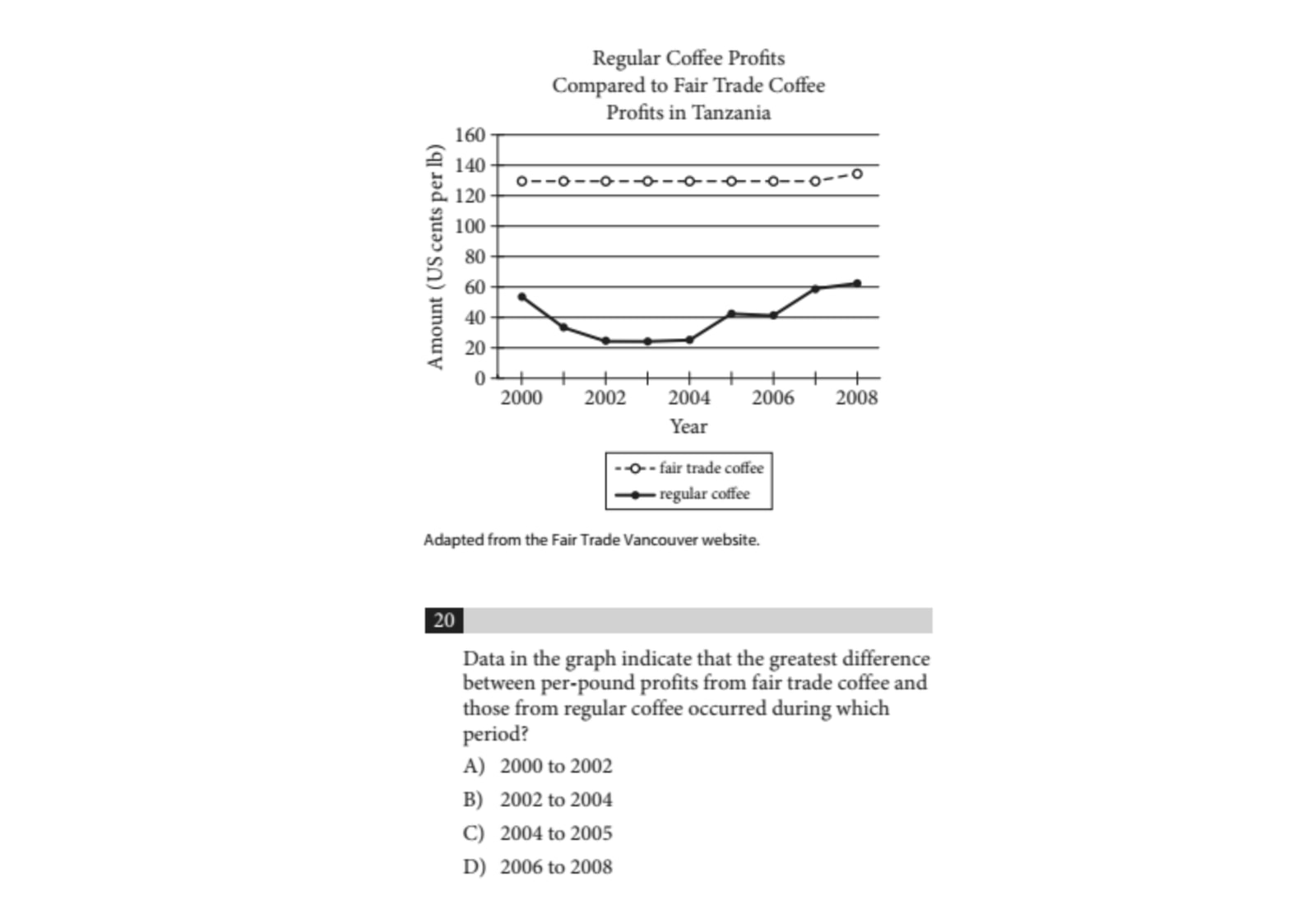
Before you attempt to answer the question, take some time to familiarize yourself with the graph. Mistakes often occur when you rush or are careless in interpreting the graph. Ensure you understand every element of the graph.
The graph compares the profits from regular coffee to those from fair trade coffee over time. The upper line, marked with unshaded circles, represents the profits from fair trade coffee, while the lower line, marked with shaded circles, depicts the profits from regular coffee. The X-axis (horizontal line) indicates the year, and the Y-axis (vertical line) shows the profit amount in U.S. cents per pound.
Next, let’s analyze the question to determine what it is seeking. The question asks us to identify the time period during which the difference between the profits of fair trade coffee and regular coffee was the largest.
Refer back to the graph to locate the answer. On the graph, the time period when the difference in profits was greatest corresponds to the points where the gap between the top line and the bottom line is the widest. You can quickly observe that the largest difference in profits occurred between 2002 and 2004. Therefore, the correct answer is B.
If you didn't quite grasp that the distance between the lines represents the difference in profits, you could still identify the profits for both fair trade and regular coffee for each answer choice from the graph and calculate the differences between them. Although this would take longer, you would ultimately arrive at the correct answer.
Here’s another example of this type of question. As always, remember to follow the necessary steps to answer it.
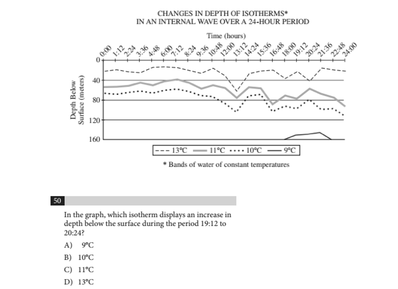
Let’s begin by examining the graph. This graph depicts changes in the depth of isotherms over a 24-hour period. The X-axis represents the time of day, while the Y-axis indicates the depth below the surface in meters. The top line of the graph illustrates the isotherm at 13 degrees Celsius, with the lines below representing isotherms at 11, 10, and 9 degrees Celsius.
Now, let’s clarify what the question is asking. We need to identify which isotherm shows an increase in depth during the period from 19:12 to 20:24. At this point, we will look back at the graph to find our answer.
Observing the Y-axis, you'll see that a lower point corresponds to a greater depth below the surface. To answer our question, we need to find the isotherm whose line moves downward from 19:12 to 20:24. The only isotherm that shows this downward trend during that timeframe is the one representing 13 degrees Celsius. Therefore, the correct answer is D.
Type #2: Interpreting Data
Interpreting data questions requires you to draw conclusions or support statements based on the provided information. You need to determine the meaning of the data in order to answer these questions effectively. It's often easiest to evaluate the answer choices to identify which one is accurately supported by the data.
First, ensure that you fully understand what the question is asking. Once you're clear about the question, review the answer choices. For each option, refer back to the data to find out whether the graphical information supports that choice.
If the data does not support a particular statement in one of the answer choices, eliminate that option. Continue the process of elimination until you arrive at the correct answer.
SAT Examples
Let’s examine an interpreting data question from the Reading section.
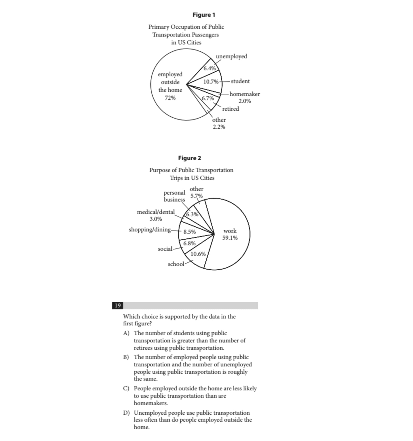
We need to use the information from the graph to determine which statement is true. As mentioned earlier, it’s most effective to review the answer choices to find the one that is supported by the data.
Let’s begin with answer choice A and refer to the first figure. We need to find out if the number of students using public transportation exceeds the number of retirees who utilize public transport. According to the pie chart, 10.7% of passengers are students, while only 6.7% are retirees. The data does support answer choice A.
Next, let’s quickly evaluate the other choices to confirm that A is indeed the correct answer. For answer choice B, the percentage of employed individuals is 72%, while unemployed individuals make up only 6.4% of passengers; thus, B is not accurate.
Looking at answer choice C, homemakers constitute only 2% of passengers, and those employed outside the home account for 72%, making C also untrue.
For answer choice D, the figure does not indicate the frequency with which various groups use public transportation. It provides data on the occupations of passengers but does not address how often they use these services. Consequently, D is also not supported by Figure 1. Therefore, the correct answer is A.
Let’s take a look at another interpreting data question from the Writing section.
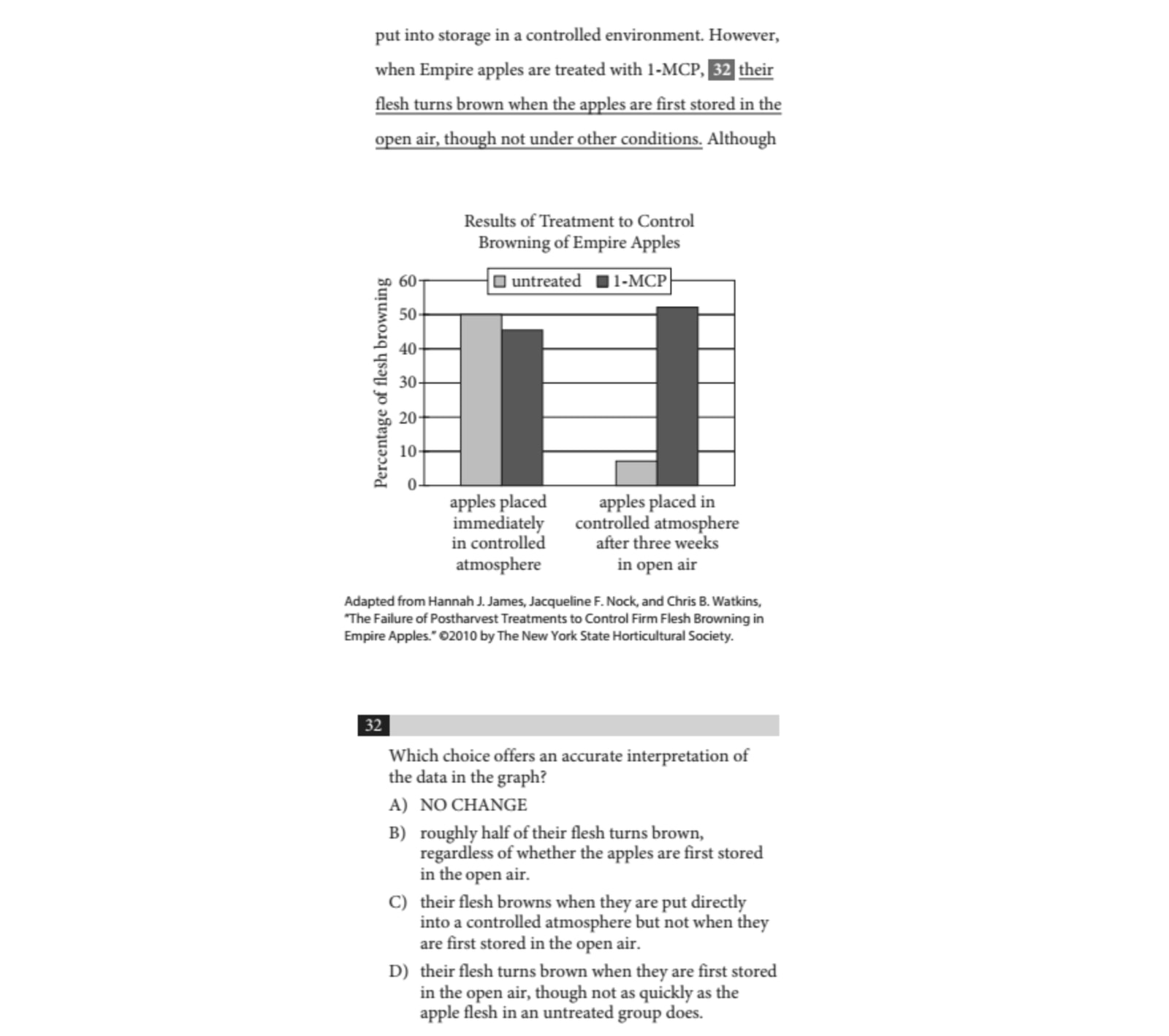
In this case, we need to determine the effects of treating Empire apples with 1-MCP based on the provided graph. The dark bars in the graph represent the apples that have been treated with 1-MCP. We will evaluate each answer choice to see which one accurately reflects the data illustrated in the graph.
Starting with answer choice A, this option is incorrect. The graph demonstrates that Empire apples treated with 1-MCP actually display nearly 50% browning when placed immediately in a controlled atmosphere.
Next, we consider answer choice B. This choice appears to be accurate. The data suggests that approximately 50% of the flesh of apples are treated with 1-MCP brown when they are either placed in open air or immediately in a controlled atmosphere. The dark bar on the right exceeds 50%, while the dark bar on the left is slightly below 50%.
Turning to answer choice C, we find that it is incorrect because both dark bars in the graph indicate that browning occurs.
Finally, for answer choice D, this option is also incorrect. It shows that there is more browning in the apples treated with 1-MCP that were stored in open air compared to those not treated with 1-MCP stored in the same conditions.
After evaluating all choices, the correct answer is indeed B.
Type #3: Combining Data With Information From the Passage
These questions require you to integrate your understanding of the data presented in the graph with the information provided in the passage. You will need to assess whether the data supports the claims made in the passage and vice versa. Often, you can arrive at the correct answer using either the data alone or a basic comprehension of the passage.
As with all quantitative questions, the first step is to ensure that you fully understand the passage. After that, similar to interpreting data questions, you will need to systematically assess the answer choices to determine if they are supported by the data.
You may also need to refer back to the passage to confirm that both the data and the text align with a particular answer choice before making your selection. Here are examples from practicing SATs to illustrate this process.
SAT Examples
Example from the Writing Section:
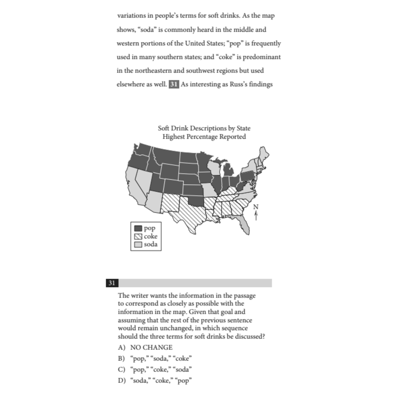
Let’s begin by determining what the question is asking. Based on the map, we need to identify which term is used in the middle and western portions of the U.S., which term is common in the south, and which term is prevalent in the northeastern and southwestern regions of the U.S. The goal is to place these terms in the correct order: middle and western U.S. first, followed by the south, and finally the northeastern and southwestern U.S.
Now, let’s examine the map to ascertain which terms are applicable to the various regions. In the middle and west, the favored term is “pop,” as indicated by the dark shaded color in that region. In the south, “coke” is the term of choice, represented by the diagonal lines in that area. Lastly, the term “soda” is commonly used in the northeastern and southwestern U.S., as shown by the lightly shaded area.
Thus, the answer should be “pop,” “coke,” “soda.” Checking the answer choices, we find the correct answer is C.
Example from the Reading Section:
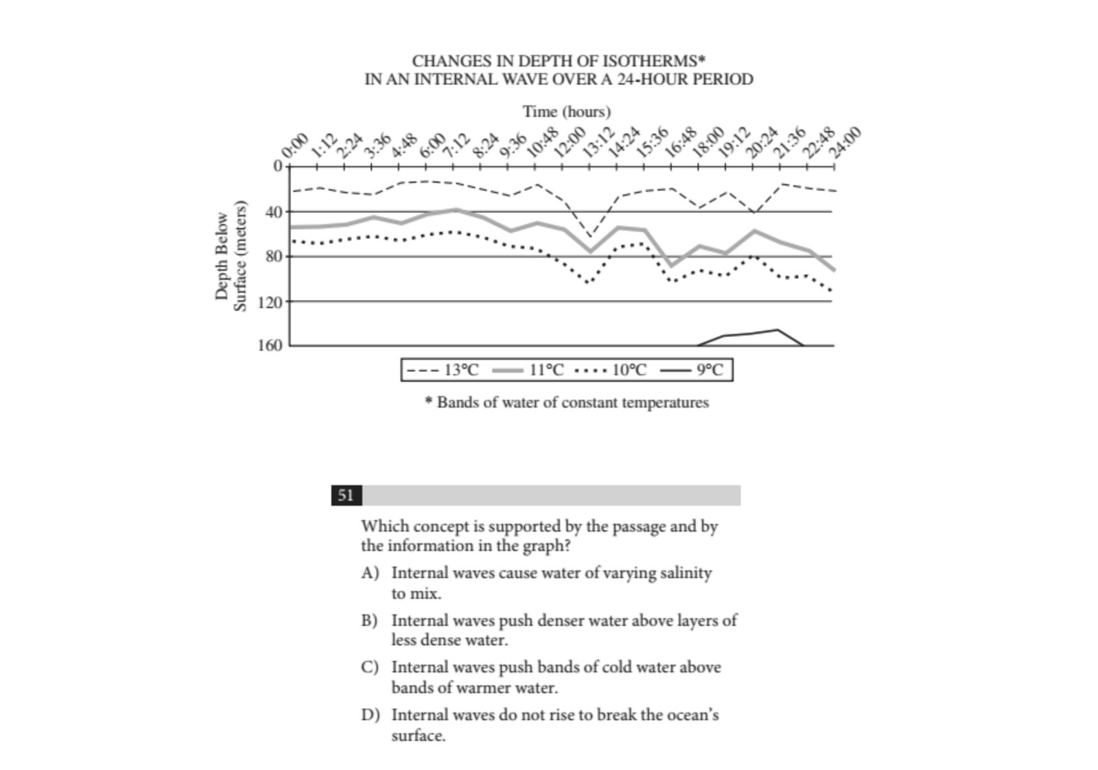
For the next question, we need to confirm that the correct answer is supported by both the passage and the graph, so we will start by eliminating answer choices that are not supported by the graph.
We can discard answer choice A because the graph does not provide any data regarding salinity.
Based on the graph alone, we might not determine which layers of water are denser, so we’ll set aside answer choice B for now. Answer choice C can also be eliminated, as the graph indicates that colder bands are positioned lower in the water.
This leaves us with answer choice D, which is correct, as none of the waves depicted in the graph rise above 0 meters. Now we are left with answer choices B and D, so we will refer back to the passage to confirm the correct choice.
Starting with B, we find a relevant excerpt from the passage: it states that colder water is denser, which aligns with the graph showing that the colder water resides below the warmer water. This means B cannot be correct.

Now let’s verify that D is indeed the right answer. The initial three sentences of the passage indicate that internal waves are situated underwater, and the graph supports this by demonstrating that the internal waves remain below 0 meters.
Consequently, the correct answer is D.

Strategies for Quantitative Questions on Reading and Writing
Here are some practical tips to help you tackle quantitative questions effectively in the Reading and Writing sections of the SAT:
- Ignore the Data in the Passage Until You’re Answering the Related Questions:
Focus solely on the text of the passage first. When you encounter a graph or chart, wait to analyze it until you are prompted to answer questions related to that data. This approach saves time and prevents distractions from written content.
- Familiarize Yourself With the Data Before Answering the Question:
Take a moment to thoroughly understand each element of the graph or chart before you attempt to answer any questions. Make sure you know precisely what is being measured and understand the units of measurement.
Read all labels carefully, including the x-axis and y-axis of a graph, as misstating these can lead to incorrect interpretations.
Ensure you recognize what each line, bar, or segment represents to avoid confusion while answering questions.
- When Answering Questions That Ask You to Interpret the Data, Go Through the Answer Choices to Determine the Correct Answer:
For questions requesting you to identify which statement accurately reflects the data, evaluate each answer choice methodically.
Check whether each statement is backed by the data available in the graph.
Discard any option that presents a claim that contradicts or lacks support from the data.
The correct answer will be the only choice clearly confirmed by graphical information, even if others seem plausible without direct backing.
- Only Refer Back to the Passage if Necessary:
For the majority of quantitative questions, you can rely primarily on the data presented. If you find that you must refer back to the passage to substantiate your answer choice, do as much as you can with the data first to eliminate incorrect options before checking the text.
This strategy will help maximize your efficiency and save valuable time during the test.
By keeping these strategies in mind, you'll be better equipped to navigate quantitative questions on the SAT Reading and Writing sections, allowing for a more focused and effective approach to answering them correctly.
Related Posts

Prepare for the Digital SAT Test with confidence! What to Know Before You Walk into the Testing Center. Read now!

Master the Digital SAT with our comprehensive guide to grammar rules, ensuring you ace the verbal section with confidence.