Effective Strategies for Analyzing Data Graphics on the SAT
Author
Hartwell
Date Published

Both the Reading and Writing sections of the SAT include questions that feature graphs, charts, and tables. In the Reading section, the Official SAT Study Guide refers to these as "interpreting data presented in informational graphics," while in the Writing section, they are described as "drawing connections between words and data." These question types contribute to your Command of Evidence subscore.
For clarity and conciseness, I will refer to these Reading and Writing questions involving data and graphics as quantitative questions. In this article, I will outline the different types of quantitative questions found in these sections. Additionally, I will provide sample questions and effective strategies to help you answer them correctly on the SAT.
Quantitative Questions on the SAT
Both the Reading and Writing sections of the SAT include quantitative questions. Typically, you can expect to see around 3-6 such questions in the Reading section and 1-2 in the Writing section.
By familiarizing yourself with the different types of quantitative questions and practicing how data is presented on the SAT, you can improve your accuracy in answering them. In this guide, I will break down the three main types of quantitative questions found in the Reading and Writing sections and provide a step-by-step approach to tackling each one.
Type #1: Data Questions
Data questions assess your ability to read and interpret the information presented in graphs, charts, or tables. These are the most straightforward quantitative questions on the SAT. I’ll provide examples and strategies to help you answer them accurately.
To approach these questions effectively:
- Carefully examine the graph – Understand what it represents and how the information is organized.
- Identify what the question is asking – These questions are usually direct, so mistakes often come from misreading either the data or the question itself.
- Refer back to the graph – The correct answer will be directly supported by the data presented.
Now, let’s go through a few examples to see how these questions work in practice.
SAT Example Preparation
To answer the following data question from a practice SAT effectively, it's essential to follow the outlined steps and thoroughly examine the accompanying graph before attempting a response. Rushing through or misreading the graph is a common source of errors.
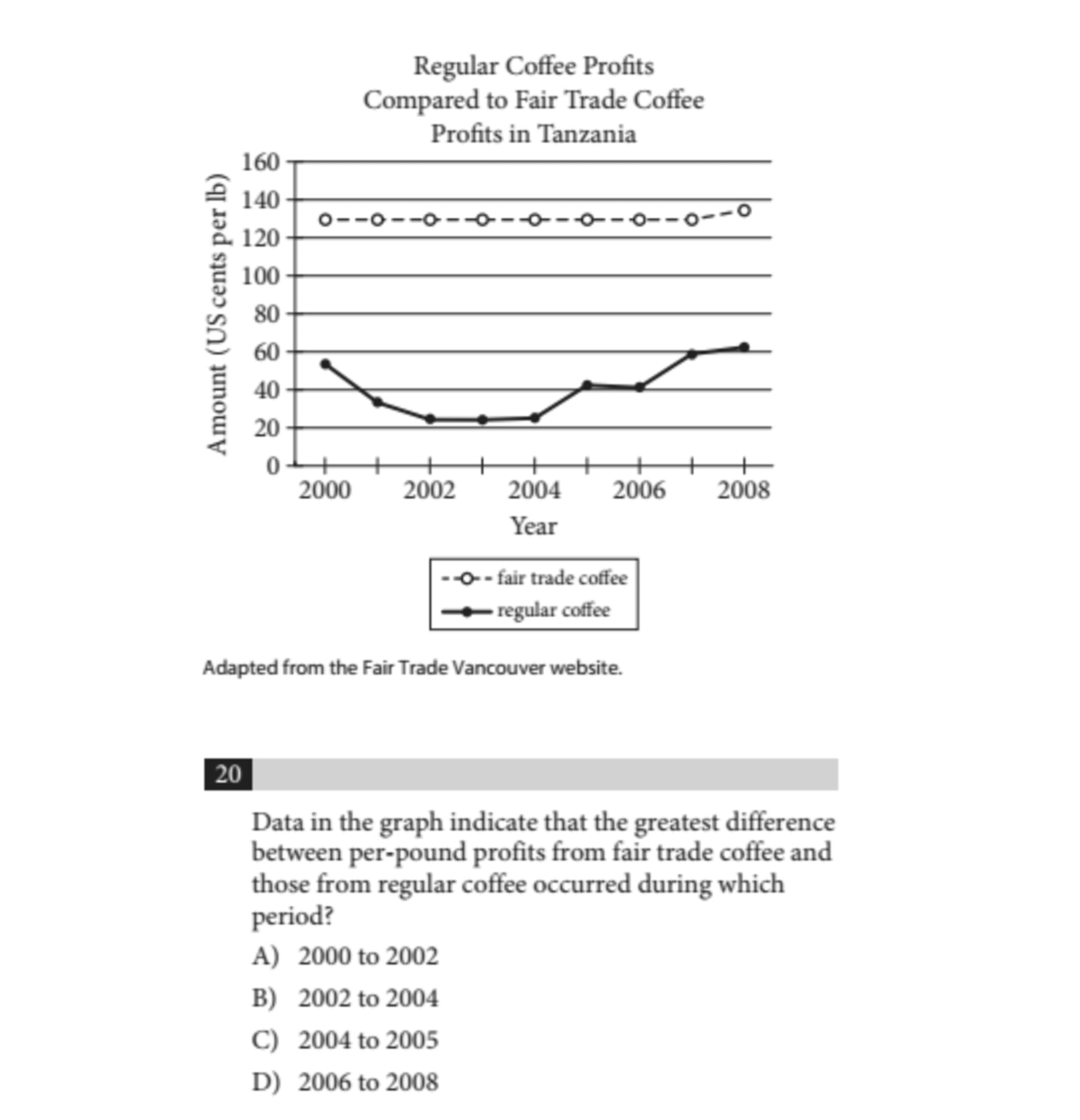
The graph compares the profits of regular coffee and fair trade coffee over time. The top line, marked with unshaded circles, represents the profits of fair trade coffee. Conversely, the bottom line, denoted by shaded circles, indicates the profits from regular coffee. The X-axis (the horizontal line) indicates the years, while the Y-axis (the vertical line) shows the profit amounts in US cents per pound.
Next, we analyze the specific question being asked, which seeks to identify the time period where the difference in profits between fair trade and regular coffee was at its peak.
Referring back to the graph, the largest difference in profits is represented by the greatest vertical distance between the top and bottom lines. A quick inspection reveals that this significant disparity occurred between 2002 and 2004. Thus, the correct answer is B.
If you weren’t aware that the distance between the lines directly reflects the profit difference, you could still find the answer by extracting the specific profit values for fair trade and regular coffee at each answer choice, then calculating the differences. Although this method is more time-consuming, it would ultimately lead you to the correct answer.
Here's another example of this type of question. It’s crucial to adhere to the necessary steps again.
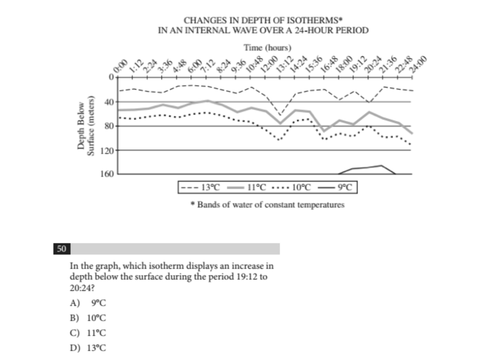
Let’s begin by reviewing the graph once more. This graph illustrates the variations in the depth of isotherms over a 24-hour timeframe. The X-axis represents the time of day, while the Y-axis indicates the depth below the surface in meters. The highest line on the graph depicts the 13-degree Celsius isotherm, while the lines below correspond to the isotherms for 11, 10, and 9 degrees.
Next, we'll identify what the question is asking. We need to find which isotherm shows an increase in depth between the time frames of 19:12 and 20:24. To figure this out, we will again refer to the graph.
Examining the Y-axis, we notice that lower points indicate greater depth beneath the surface. Thus, in order to respond correctly to our question, we need to pinpoint the isotherm whose line descends from 19:12 to 20:24. The only isotherm demonstrating this downward trend in that timeframe is the 13-degree Celsius line. Therefore, the correct answer is D.
Type #2: Interpreting Data
These questions go beyond simply reading the data—they require you to draw conclusions or determine which statement is best supported by the information presented. Instead of just identifying values, you need to analyze what the data implies.
To approach these questions effectively:
- Understand the question – Carefully read the question to determine what conclusion or relationship it is asking you to identify.
- Examine the answer choices – Work through each option one by one, referring back to the data.
- Eliminate unsupported choices – If the graphical information does not support an answer choice, rule it out. Continue eliminating options until you identify the correct response.
By following these steps, you can systematically determine the most accurate answer. Now, let’s apply this method to some SAT example questions.
SAT Example: Interpreting Data Question
Let's examine an interpreting data question from the Reading section.
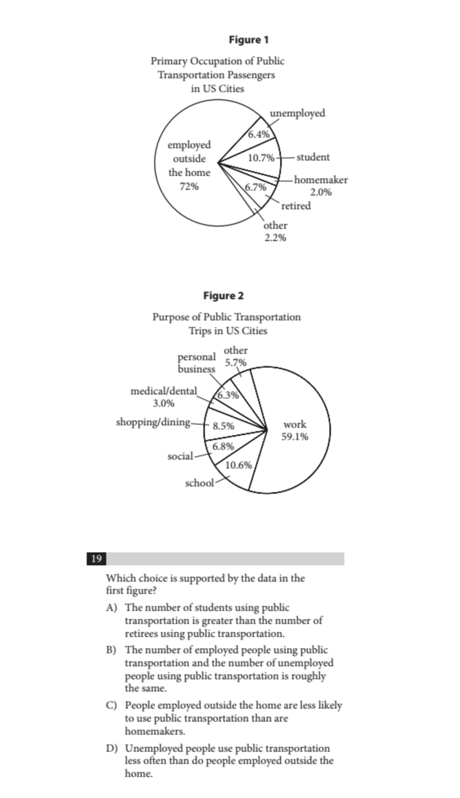
To answer this question, we need to analyze the graph to find which statement holds true. It's often most effective to review each answer choice systematically and check which one is backed by the data.
Starting with answer choice A, we need to determine whether the number of students using public transportation exceeds the number of retirees doing the same. Looking at the pie chart, we find that 10.7% of passengers are students, while only 6.7% are retirees. This data does support answer choice A.
Next, let's check the other choices to confirm that A is the correct response. For answer choice B, the graph shows that employed passengers make up 72% while unemployed passengers are only 6.4%, making B untrue. As for answer choice C, homemakers account for just 2% of passengers, in contrast to the 72% of those employed outside the home, thus C is also untrue.
Regarding answer choice D, the graph does not provide any information on how frequently various groups utilize public transportation. It only illustrates the occupations of the passengers, without addressing their usage frequency. Therefore, answer choice D is unsupported by Figure 1, confirming that the correct answer is A.
Let's tackle another interpreting data question from the Writing section:
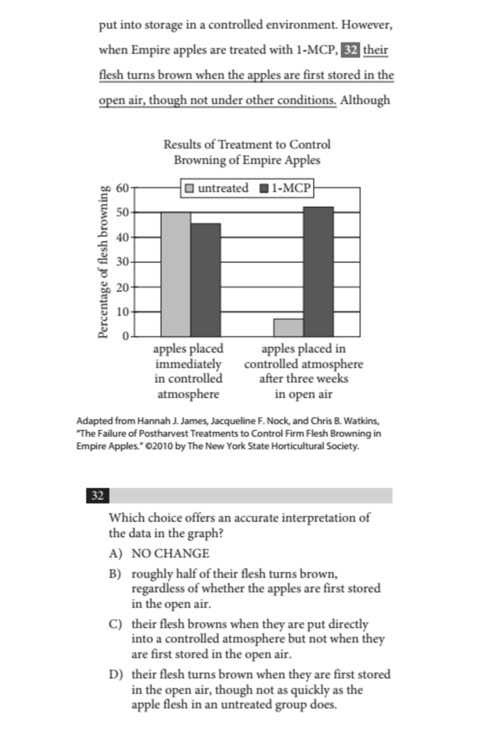
In this scenario, we need to determine what occurs when Empire apples are treated with 1-MCP, referencing the sentence from the passage. The dark bars in the graph denote apples that underwent 1-MCP treatment. We'll analyze each answer choice to check which one accurately reflects the data presented in the graph.
Expanding on answer choice A, it is incorrect since the graph indicates that Empire apples show nearly 50% browning after being treated with 1-MCP and stored immediately in a controlled atmosphere.
Looking at answer choice B, it seems to be true. The data suggest that approximately 50% of the flesh of apples treated with 1-MCP displayed browning when exposed to open air versus those placed immediately in a controlled atmosphere. The dark bar on the right (open air) is slightly above 50%, while the dark bar on the left (controlled atmosphere) is slightly below 50%.
Answer choice C is incorrect because both dark bars indicate browning is present.
Lastly, answer choice D is also incorrect as it shows more browning in 1-MCP-treated apples stored in open air than in untreated apples kept under the same conditions.
Thus, the correct answer here is B.
Type #3: Combining Data With Information From the Passage
These questions require you to analyze both the data presented in graphs, charts, or tables and the information provided in the passage. Your task is to determine whether the data supports, contradicts, or aligns with the passage’s claims.
In many cases, you can answer these questions by focusing primarily on the data, requiring only a general understanding of the passage.
To approach these questions effectively:
- Understand the passage – Make sure you grasp the key idea or claim that the data might support or contradict.
- Evaluate the answer choices – Just like interpreting data questions, go through each option and compare it to the data.
- Cross-check with the passage – If necessary, refer back to the passage to confirm whether both the textual and graphical information support a particular answer choice.
By following these steps, you can accurately determine which answer choice is best supported by both the passage and the data. Now, let’s examine some example questions from practice SATs.
SAT Example: Writing Section Analysis
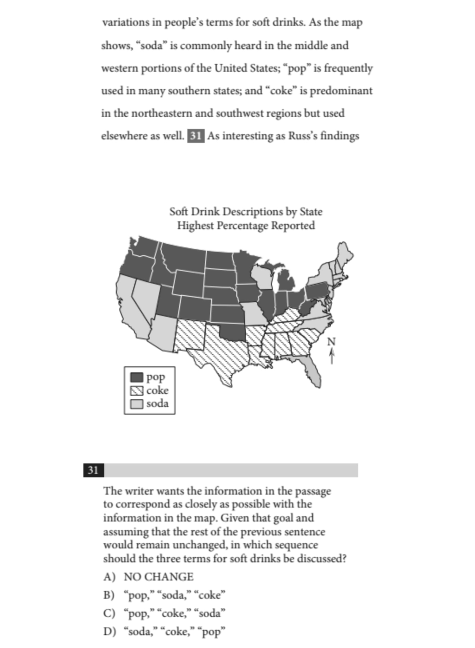
To effectively address this question, we must first understand what it's asking. The task is to identify the terms associated with different regions of the US based on the provided map. Specifically, we need to determine which term is prevalent in the middle and western parts of the country, which term is used in the south, and which one is common in the northeastern and southwestern regions. We'll arrange these terms in the following order: middle and western US first, then the south, followed by the northeastern and southwestern US.
Upon examining the map, we find that "pop" is the prevalent term in the middle and western US, as indicated by the dark shaded area associated with the usage of this word. In the southern region, "coke" is the preferred term, which is represented by the diagonal lines in that area. Lastly, in both the northeastern and southwestern US regions, "soda" is the commonly used term, denoted by the lightly shaded area on the map.
Thus, the correct order of the terms is: "pop," "coke," "soda." We can then look at the answer choices to find the correct one. The answer is C.
SAT Example: Reading Section Analysis
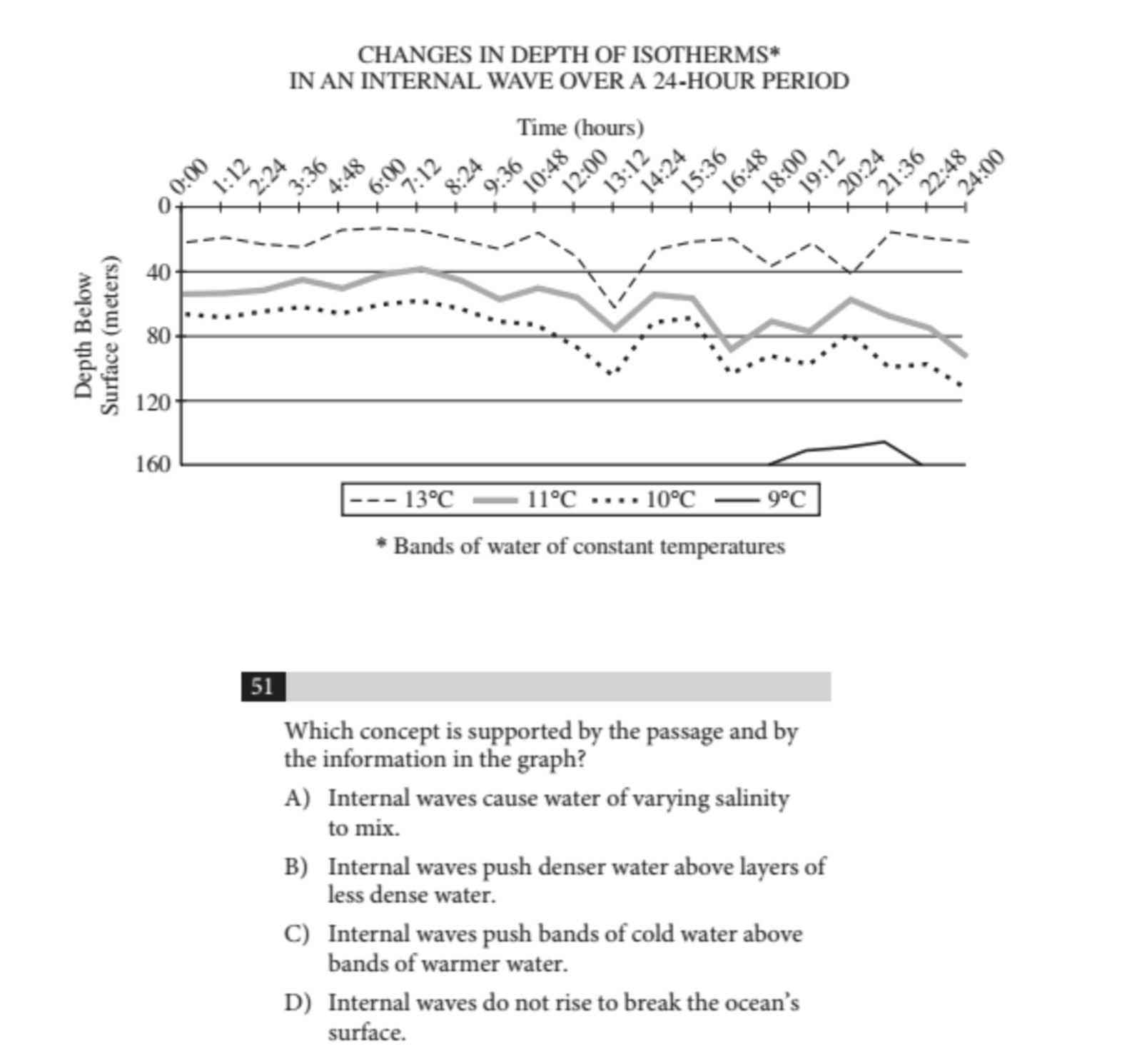
In this example, to find the correct answer, we need to ensure that it is supported by both the passage and the graph. We can begin by eliminating answer choices that lack support from the graph.
Firstly, we can dismiss answer choice A because there is no information regarding salinity presented in the graph. As for answer choice B, we won’t eliminate it just yet since we need to determine the density of the water layers based on the graph.
Next, answer choice C can also be eliminated, as the graph illustrates that the lower temperatures correspond with lower water levels. At this point, we are left considering answer choices B and D.
Next, we will turn to the passage to see which choice is supported. Starting with B, the relevant excerpt from the passage notes that colder water is denser, and according to the graph, colder water is situated beneath warmer water. Therefore, choice B cannot be correct.

Now we need to confirm that D is indeed the right answer. The initial three sentences from the passage state that internal waves are positioned underwater, which aligns with the graph showing that these waves never rise above 0 meters. Thus, the correct choice is D.
Strategies for Quantitative Questions on Reading and Writing
Here are some essential strategies to help you tackle quantitative questions in the SAT Reading and Writing sections efficiently.
Ignore the Data in the Passage Until You Need It
When reading a passage that includes a graph or chart, don’t waste time analyzing the data immediately. Instead, focus on reading the passage first. When you reach a question that requires you to interpret the data, refer back to the graph or table at that point. This approach helps you stay efficient and prevents unnecessary distractions.
Understand the Data Before Answering the Question
Before selecting an answer, take a moment to analyze the key elements of the graph or chart. Consider:
- What is being measured?
- How is it being measured?
- What do the labels, scales, and axes represent?
Misinterpreting a graph’s x-axis or y-axis, or misunderstanding what a line or bar represents, can lead to incorrect answers. Reading the data carefully ensures accuracy.
Use the Answer Choices to Guide Interpretation Questions
For questions that ask you to determine which statement is true based on the data:
- Review each answer choice carefully.
- Cross-check it with the data.
- Eliminate any choice that is contradicted by or not directly supported by the data.
Sometimes, an answer may seem logical, but it must be explicitly backed by the data to be correct. The right answer will be the only one that is fully supported by graphical information.
Only Refer Back to the Passage When Necessary
For most quantitative questions, the data alone provides enough information to determine the correct answer. Before revisiting the passage, try to eliminate as many incorrect answers as possible using the data. If you still need clarification, then check the passage for additional context. This method will save time and improve efficiency.
By applying these strategies, you can confidently approach quantitative questions and maximize your accuracy on the SAT Reading and Writing sections.
Related Posts

Struggling with the Digital SAT Reading & Writing section? Discover 5 common mistakes students make and actionable tips to boost your score!

Boost your SAT Writing score! Explore essential tips, avoid common mistakes, and sharpen your grammar and error-spotting skills.